Design terminology: adopting the concepts that fit your workflow
Every profession has its own terminology, or lingo if you will. So does design. For me, as a self-taught designer, I noticed that a lot of the terminology used in design is often more confusing than it actually helps me in my work. Terms like style guide, design language, design system, design kit, and pattern library did speak to my imagination, but I never really grasped what the meaning behind it and the distinction was. To me, they seemed more subject to trend, than actually helpful.
My personal confusion challenged me to dive deeper into their meaning and – more importantly – how we could apply the concept behind those terms to our workflow. And that’s exactly what this blog post will be about. It’s not my intention to give a theoretical explanation of design terminology in general. This will be about which concepts actually serve the needs of our design team at Yoast. How they help us in our daily work.
The needs of the design team
The needs of our design team served as a starting point for me. What do we need to be able to work efficiently and deliver quality and consistent work and also make it easy to transfer it to our development teams? For us, this meant we needed a clear set of rules and boundaries. This, to objectify the arbitrary and subjective nature of design. We wanted to create a transferable and transparent context that everybody understands and can work with. Inside our design team, but also beyond that.
This may come across as restrictive, which conflicts with a profession that we perceive to be creative and innovative. And I think this perception is correct. But for me, it’s not something that’s set in stone. This ruleset is something designers should not only use (or conform to), but can and should contribute to. Designers should claim ownership over it.
Looking for the right means of support
In the process of establishing this ruleset, we often share and discuss the design principles of other companies within our team. And while I often respect and admire the creativity behind them, they seldom teach me anything. They feel like packaging. Made for marketing purposes. And while I do like to think about the principles that drive us and our brand. I also think they should actually aid us in our work on a daily basis and should, therefore, be concrete and actionable. Most of the time they are not. But it did stimulate us to define a set of principles that form the basis of how we practice design at Yoast and what it needs to convey to our users. It’s these basic principles that we call our design language.
Design language: the basic principles of design
Like I stated above, we quickly discovered that creating a design language holds the danger of coming across as packaging. We really strived for creating principles that are tangible. That they are an actual derivative of our culture at Yoast and as something that our users would recognize us by. But also something that can serve as a mindset when working on a design. For us, this means that design needs to be positive, diverse (all our users need to feel welcome when using our products), colorful, enthusiastic and accessible. These principles apply to all our design disciplines. From UX design to graphic design and illustration.
Of course, these are only still principles. The next step for us was to transform this into concrete guidelines. These guidelines are what we call our style guide.
Style guide: from principles to practice
For us, the style guide is a visual translation of our design language. It is our ruleset for the use of basic visual elements like colors, fonts, logos, and (product) imagery. It serves as a basis for all design work and originates from our branding team, with our brand manager as its guardian.
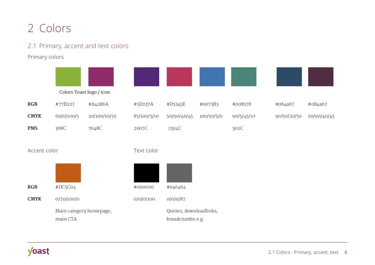
Part of the colours section of our Yoast style guide
After establishing the style guide, we started adding actual components (buttons, form fields, notifications, modals, et cetera) that we use in our products. These components derive from the style guide, but where the style guide is still somewhat conceptual, components are the elements that actually build our products. It’s where branding meets UX. The comprehensive library of all our components is what we call the design kit.
Design kit: our comprehensive component library
Since we work with Sketch for our design work at Yoast, our design kit is actually nothing more than a symbol library for Sketch. It helps us to quickly reuse and add components to our designs.
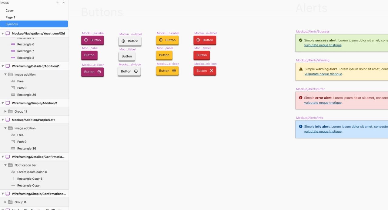
The button – and alert section of our Sketch symbol library
Having a design kit enabled us to work more efficiently. As I said it eliminated the need to recreate components. But what’s still lacking are the rules for its usage. In which context do you use which component? For this, we needed to create a so-called pattern library.
Pattern library: the rules for using components
For us, a design pattern is a solution to a recurring problem. This goes a step further than our design kit. Where the design kit serves as a central source of components, the pattern library describes which components to use in which context. It helps you identify problems more quickly and offers standardized solutions.
The benefit is that – like with the design kit – it speeds up your workflow. But it also leads to consistency in design, which makes our products more intuitive (and less confusing) to our users.
Having a design language, a style guide, a design kit, and a pattern library really help us in professionalizing our workflow. But these gains are still only limited to us, the design team. We really wanted to look beyond the borders of our own team. To create a system that not only helps us in professionalizing our workflow, but also benefits other teams within our company, and maybe even our community outside of it. A system that is open to others. Our design system.
Design system: tying everything together
Our design system is all of the above combined. Or, actually, it’s what we strive for it to be. At the moment we’re in the middle of developing our design system. Our own Yoast Design platform, which will serve as a central source that explains our design principles, lists and documents our design components and describes the related patterns.
The platform will be accessible for designers to use as a reference work for design patterns (and other related design decisions). For developers to use as a code reference. And for our community to use as a source of knowledge and education.
As I said, this platform is still in development, but I’ll gladly keep you posted on its progress.
Final thoughts
Like many professions, design is ever in motion. New approaches to our profession arise often which can lead to a point where you can’t see the wood for the trees. That’s why it’s important to keep a critical mind. Try to really think for yourself. What is it that I – or my team – needs? Once you have got a clear image of those needs, it becomes much easier to delve into the concepts that cater to those needs. I want to emphasize the word concept because that’s what this blog post is about. It’s about not letting yourself be confused by the terminology. It’s about claiming ownership over the concepts behind the terminology. And it’s about using them in a way that enables you to do an even better job.